Android Development: Adding New Activity, Explicit Intent and Top App Bar with Jetpack Compose

Introduction
In this article, we will continue with the practical demonstration of Android development using our “Demo One” Android project as an example.
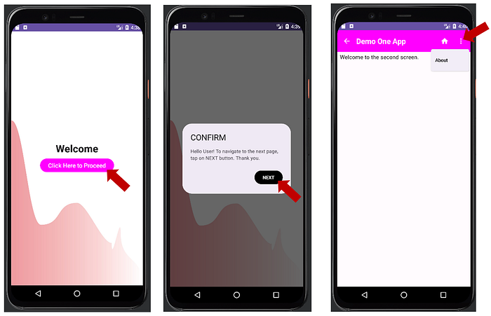
Note that in my previous article, I demonstrated how to add AlertDialog to MainActivity.kt, and programmed it to show when the “Click Here to Proceed” button is clicked. The AlertDialog contains a button with the text “NEXT” (as in Figure 1).

When the “NEXT” button is tapped or clicked, the AlertDialog will close, and then, the app will navigate back to MainActivity.
In this article, we will add a new Activity named “SecondActivity”. Next, with the use of “intent”, we will program the AlertDialog “NEXT” button to navigate to SecondActivity when tapped. Next, we will add top app bar to our SecondActivity.
Let us now open our “Demo One” project (as in Figure 2) and continue with the development process.

Creation of a new Activity named “SecondActivity”
There are different methods of creating a new Activity in Android Studio. In this demonstration, we will be using the following simple method.
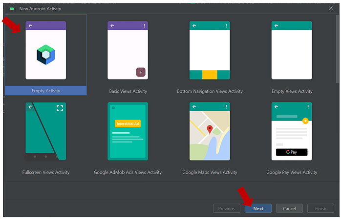
To create a new Activity, click on “File” from the menu bar. Next, click on “New”. Next, click on “Activity”, and then, click on “Gallery” (as in Figure 3).

Next, select the template for empty Compose Activity, and then click on “Next” (as in Figure 4).
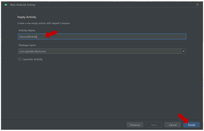
Next, modify the name of the Activity to “SecondActivity”, and then, click on “Finish” (as in Figure 5).
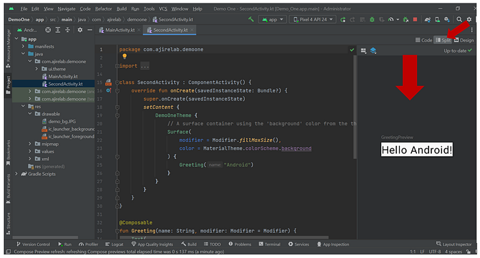
SecondActivity.kt is now created. You can click on “Build & Refresh” from the Split screen to preview the design (as in Figure 6).
Addition of Intent
We will now add an explicit intent to the “NEXT” button that is on our AlertDialog. Note that an explicit intent is used to start an Activity within the same Android application. In other words, it is a mechanism that can be used to navigate the user from one screen to another within the same application.
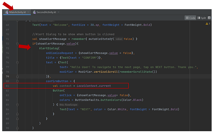
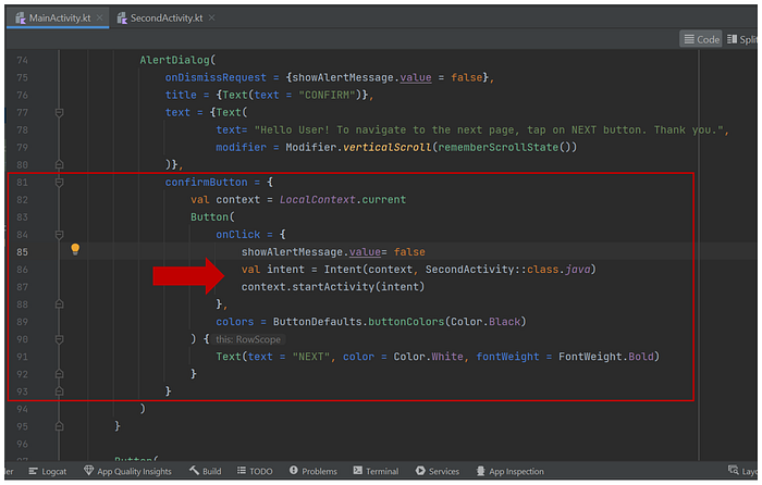
To add the intent, we will open the MainActivity.kt, and go to the section for the DemoScreen composable function. Inside the AlertDialog, we will locate the confirmButton, and then, above Button composable, we will call the current local context and save it in an immutable variable named “context” (as in figure 7). If LocalContext is underlined in red, you can press “alt + enter” key to import it. Note that LocalContext provides access to the current Context.
val context = LocalContext.current
Next, inside the onClick function of the button, we will add our intent to the existing codes (as in Figure 8).
val intent = Intent(context, SecondActivity::class.java)
context.startActivity(intent)
With that done, SecondActivity screen will open when the “NEXT” button on the AlertDialog is tapped.
Addition of Top App Bar
The “top app bar” is also known as “action bar” or “toolbar”. It can be used for branding, and for the display of screen title, navigation and actions.
In the Top App Bar, we will have a back navigation icon, a Text composable for displaying our screen title, a home icon button, another icon button for “More”, and “About” DropDownMenu.
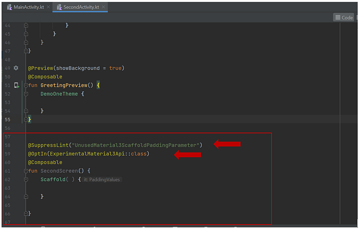
First, we will open SecondActivity.kt and delete the default lines of code related to “Greeting”.
The content of SecondActivity.kt should now be updated as shown in Figure 9.

Inside SecondActivity.kt, we will add a composable function named “SecondScreen”.
Inside the SecondScreen function, we will add a Scaffold as its first element. With the Scaffold, we can add Material components like TopAppBar, NavigationBar, FloatingActionButton, among others.
Scaffold receives an instance of paddingvalues that should be applied to the content root. For now, we will suppress the scaffold padding parameter by adding a SuppressLint annotation above the SecondScreen function. Also, above the function, we will add the OptIn annotation for ExperimentalMaterial3 Api (as shown in Figure 10).
@SuppressLint(“UnusedMaterial3ScaffoldPaddingParameter”)
@OptIn(ExperimentalMaterial3Api::class)
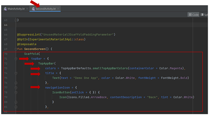
Let us now update the scaffold by adding some lines of code for our Top Bar.
First, we will call the TopAppBar function and define the color, title and NavigationIcon (as shown in Figure 11).
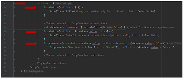
Next, we will use the “actions” function, and inside it, we will add “Home” icon for our action button, a MoreVert icon that will make the dropdown menu items to be shown when tapped, and “About” for our dropdown menu item (as in Figure 12). Note that above the IconButton function, we have remembered a mutable state, set its initial value to “false” and stored it in a variable named “showMenu”. Inside the onClick listener of the MoreVert IconButton, we have set the value of showMenu to “true”. Therefore, when it is clicked, the dropdown menu items will show. Next, for the DropdownMenu function, we have set the value of the “expanded” parameter to showMenu.value which is “false”; also, for the onDismissRequest, we have set the value of showMenu to “false”. Furthermore, in the body of the DropdownMenu function, we have added our “About” DropdownMenuItem, and set the value of showMenu to “false” in its onClick parameter, so as to simply close the dropdown menu when “About” is tapped. Note that we can still add more actions to be performed inside the onClick parameter of the “About” dropdown item.
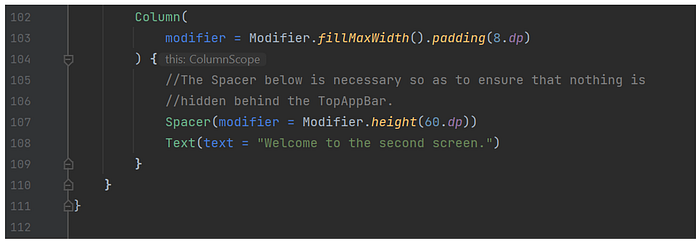
Next, we will add a Column composable that will fill maximum width of the screen and have a padding of 8.dp. Inside the Column layout, we will add a Spacer with a height of 60.dp and some text (as in Figure 13).
Testing the App
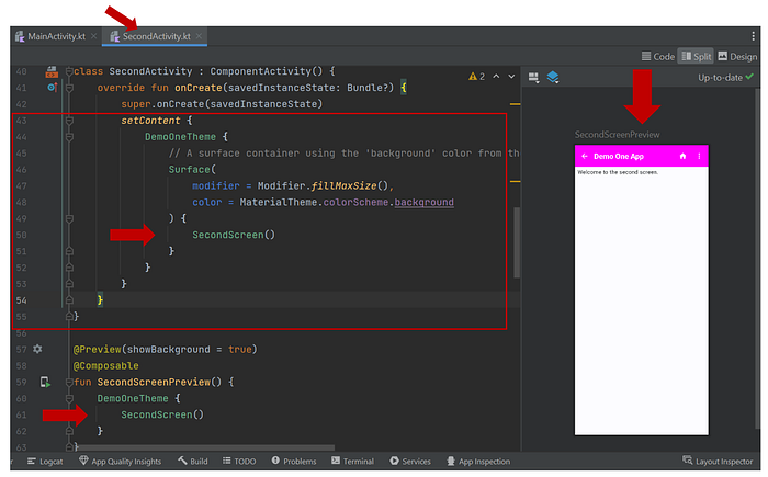
We can now scroll up to the SetContent function and call SecondScreen().
Also, inside our Preview, let us update the function name to “SecondScreenPreview” and then, we will call SecondScreen(), as in Figure 14.
Next, we will run our emulator and test how the app works. The app worked as expected (as shown in Figure 15).
That’s it.
Thank you for reading.
Happy learning and coding.

