Gantt Charts in Python with Plotly
Objective
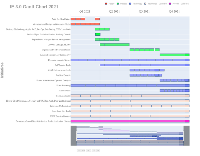
I’m not going to give you a lesson on Gantt Charts. They were created to show the progress of individual tasks/projects of a larger initiative(s).
Since this really isn’t an overly impressive chart and one likely won’t gain much from it, the only reason I’m posting this is because a lot of these plotly timeline figure parameters are pretty obscure; hard to find information regarding some of them — not a lot of examples out there. Putting this out online because I’m guessing it will save some people some time/hassle when trying to modify things like tick sizes or xaxis label formats.
*hint the quarterly format was not easy to find. It’s basically a hack.
Code
*The full code is on my github. I took out the category orders because I needed to arrange the above chart just so, and leaving that parameter in here, was like adding a small short story to the code sample, so I removed it. But the spreadsheet and the jupyter notebook is in my github if you want this EXACT one lol.
import pandas as pd
import plotly.express as px
import plotly.figure_factory as ff
import plotly.graph_objs as go
import chart_studio
import chart_studio.plotly as py
import chart_studio.tools as tlsdf = pd.read_csv('gantt_chart_new.csv',encoding='latin1')
df['Start'] = df['Start'].astype('datetime64')
df['Finish'] = df['Finish'].astype('datetime64')
# print(df.dtypes)
# print(df.head())colors = {'Technology' : 'rgb(30,144,255)'
          , 'Technology - Date TBD' : 'rgb(211,211,211)'
          , 'People' : 'rgb(95,158,160)'
          , 'Process' : 'rgb(0,0,128)'
          , 'Process - Date TBD' : 'rgb(211,211,210)'}

orders = list(df['Task'])fig = px.timeline(df
                  , x_start="Start"
                  , x_end="Finish"
                  , y="Resource"
                  , hover_name="Task"
#                   , facet_col="Dimension"
#                   , facet_col_wrap=40
#                   , facet_col_spacing=.99
#                   , color_discrete_sequence=['green']*len(df)
                  , color_discrete_sequence=px.colors.qualitative.Prism
                  , opacity=.7
#                   , text="Task"
                  , range_x=None
                  , range_y=None
                  , template='plotly_white'
                  , height=1200
#                   , width=1500
                  , color='Dimension'
                  , title ="<b>IE 3.0 Gantt Chart 2021</b>"
#                   , color=colors
                 )fig.update_layout(
    bargap=0.5
    ,bargroupgap=0.1
    ,xaxis_range=[df.Start.min(), df.Finish.max()]
    ,xaxis = dict(
        showgrid=True
        ,rangeslider_visible=True
        ,side ="top"
        ,tickmode = 'array'
        ,dtick="M1"
        ,tickformat="Q%q %Y \n"
        ,ticklabelmode="period"
        ,ticks="outside"
        ,tickson="boundaries"
        ,tickwidth=.1
        ,layer='below traces'
        ,ticklen=20
        ,tickfont=dict(
            family='Old Standard TT, serif',size=24,color='gray')
        ,rangeselector=dict(
            buttons=list([
                dict(count=1, label="1m", step="month", stepmode="backward"),
                dict(count=6, label="6m", step="month", stepmode="backward"),
                dict(count=1, label="YTD", step="year", stepmode="todate"),
                dict(count=1, label="1y", step="year", stepmode="backward"),
                dict(step="all")
            ])
            ,x=.37
            ,y=-.05
            ,font=dict(
                family="Arial",
                size=14,
                color="darkgray"
    )))

    ,yaxis = dict(
        title= ""
        ,autorange="reversed"
        ,automargin=True
#         ,anchor="free"
        ,ticklen=10
        ,showgrid=True
        ,showticklabels=True
        ,tickfont=dict(
            family='Old Standard TT, serif', size=16, color='gray'))

    ,legend=dict(
        orientation="h"
        ,yanchor="bottom"
        ,y=1.1
        ,title=""
        ,xanchor="right"
        ,x=1
        ,font=dict(
            family="Arial"
            ,size=14
            ,color="darkgray"))
)fig.update_traces( #marker_color='rgb(158,202,225)'
                   marker_line_color='rgb(8,48,107)'
                  , marker_line_width=1.5, opacity=0.95)fig.update_layout(
    title="<b>IE 3.0 Gantt Chart 2021</b>",
    xaxis_title="",
#     margin_l=400,
    yaxis_title="Initiatives",
#     legend_title="Dimension: ",
    font=dict(
        family="Arial",
        size=24,
        color="darkgray"
    )
)# fig.show()
fig.write_html("C:/Users/maxwell.bade/Downloads/ie_3_gantt.html")
go.FigureWidget(fig)
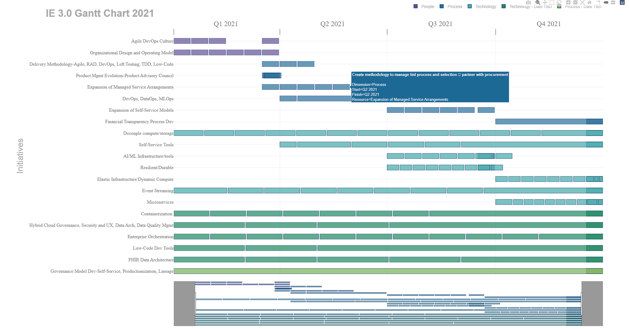
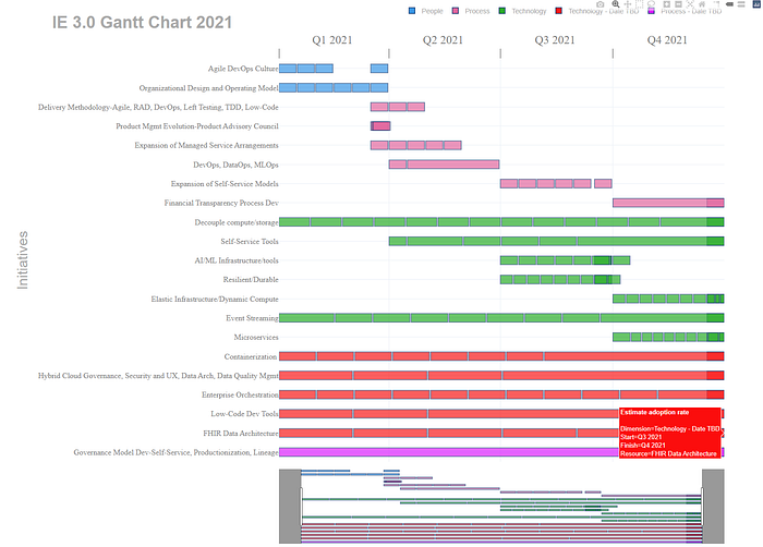
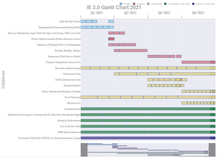
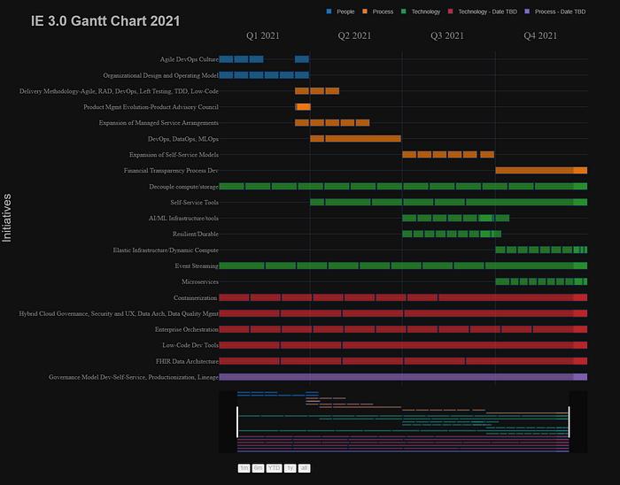
Modifying the Color Sequence
The template and the color_discrete_sequence are two ways/parameters to change the look/feel of the chart. There are a few more ways — and you can certainly manually change the bar colors if you need, but below are some ideas for coloring.
Using the dark24 color sequence:
Using the safe color sequence with the seaborn template:
Using the plotly_dark template with the D3 color sequence
Using the plotly default template and the Light24 color sequence:
Thanks for reading.
Max